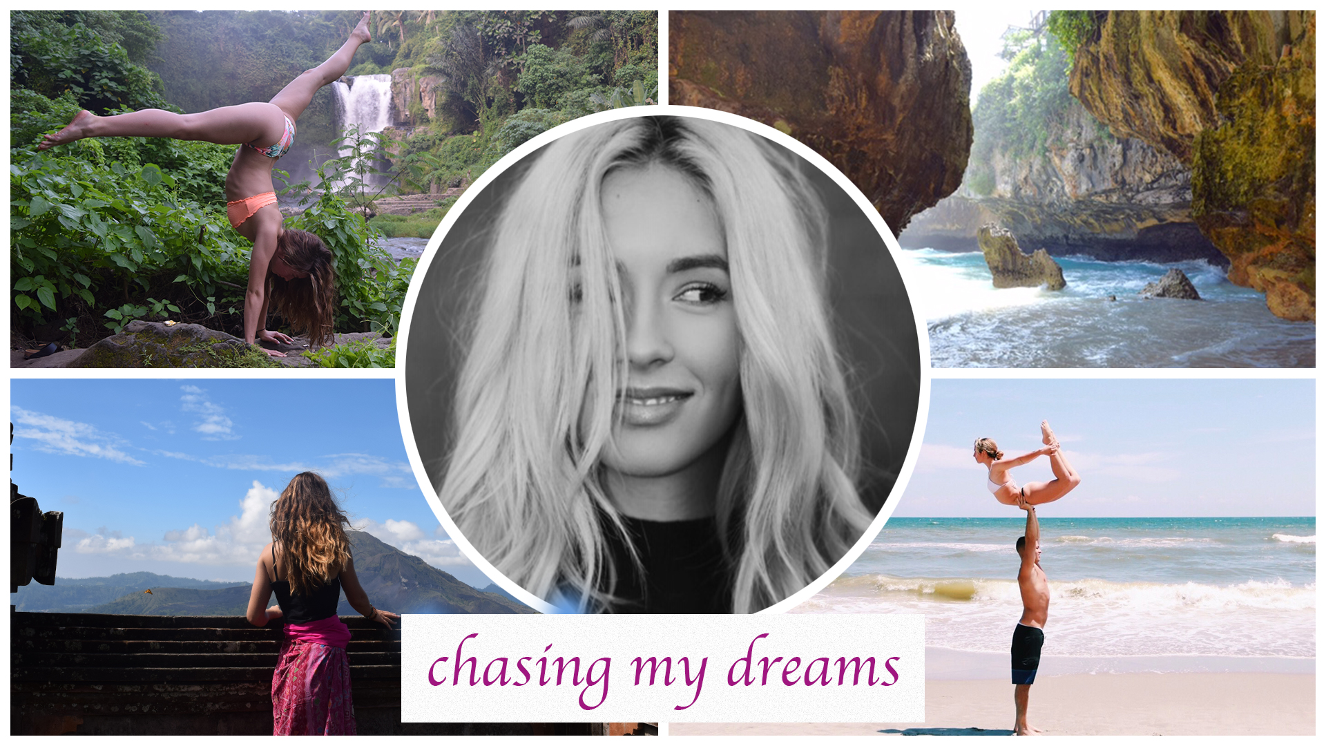
I really wanted to keep the design crisp and clear. I also wanted to keep the focus on the photographs and what I wanted to portray in them. As I stated in my draft collage, I really want the collage to give a feeling of freedom, exploration, adventure, and happiness. I also really wanted to give the viewer a sense and feeling of who I am and what I am passionate about.
I added in my tagline in the bottom part of the collage which I think was a very nice revision and recommendation from my classmates! I played around with a few different placements and decided that the bottom center was the most cohesive. I chose the color dark purple/pink because, I think it adds a nice balance between the colors already in the collage. At first, I tried blue and I think that it blended in too much with the other blues in the collage.
When I first added in my words in the bottom of the collage I wasn’t sure if I wanted the edges to be blended in or straight and sharp. I played around with a few different designs and decided on this final design where they are sharp and crisp because I think it compliments the shape of my collage best. When it was blended, I felt it was too “busy” and got lost within the other pictures. I think this way the font sticks out and is very clear and easy to read.
I chose to place the photographs in the places that they are in because, I really like how the colors compliment each other. I like how the top two have an earthy green in them whereas, the bottom two photographs have different shades of blue. The bottom left photograph has a pop of pink which I think compliments the color I chose for the font.
I also used the straightening tool in the bottom left photograph to make sure that the line of the ledge was straight with the white lines separating the photographs.
I’m very happy with how this collage turned out! I tried to keep the collage looking balanced and clean! I hope you can see that and like the revisions I’ve made to my collage!
